


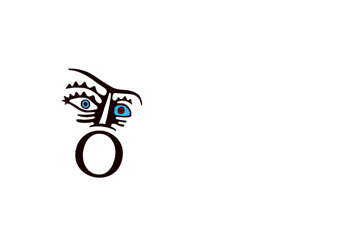
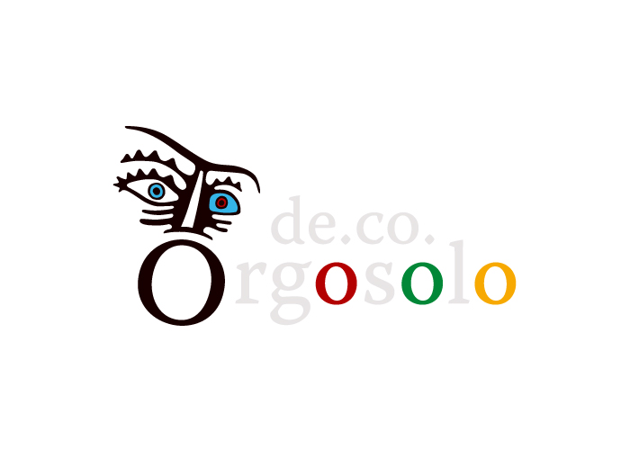
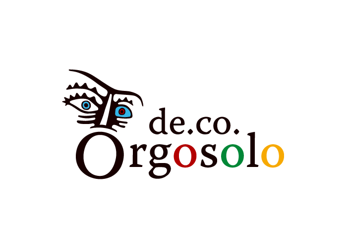
Client: DE.CO Orgosolo
Orgosolo shouting to the world its peculiarities, its uniqueness, with a strong and decided, synthesizes unmistakable face painted on the rock at the entrance of the village above the "O", which refers to the mouth becoming "Canto a Tenore" priceless heritage.
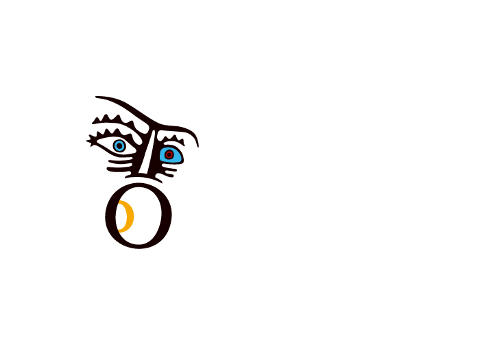
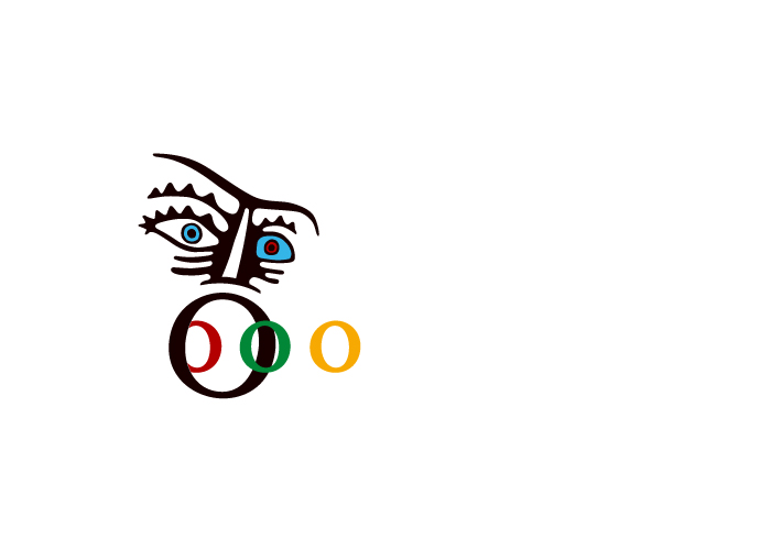
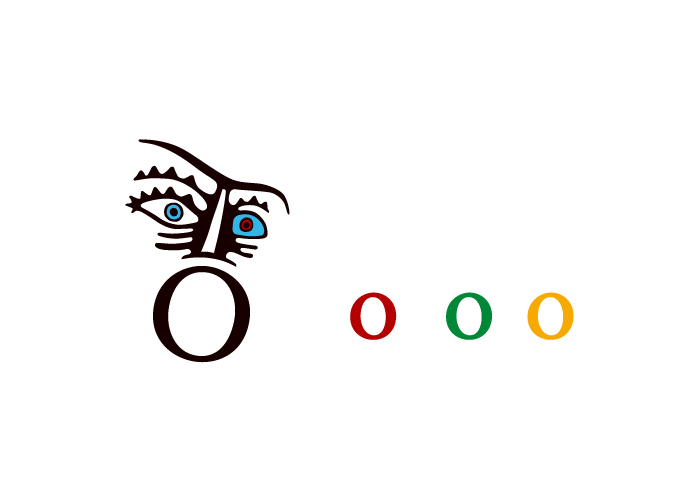
This is the conceptual starting point of the proposal, in which just the letter "O" suggests the initial creative strategy that dictated the graphic design logomarchio. The other "o" contained in the name Orgosolo, are in fact invested with meanings related to the various areas covered by the system De.Co., and become almost the metaphorical poles of attraction that in reality the country strongly wants to strengthen and spread. The red, as a symbol of man's craft and the green of nature and the area in general, the yellow tied to the excellent typical agro-food products. The blue eyes, as in the original stone, brings us back to the concepts related to tourism, outdoors, thus completing the range of colors that gives to the whole movement, positivity, visibility and recognition. In addition, this color palette is fully represented by the beautiful colors of the male and female costumes of Orgosolo.
Finally, the entire system logomarchio is the perfect link between the color of its items with the brown color of the face and the other letters, color sober and austere, deliberately approached the culture, the real glue of all that concerns Orgosolo.
Finally, the entire system logomarchio is the perfect link between the color of its items with the brown color of the face and the other letters, color sober and austere, deliberately approached the culture, the real glue of all that concerns Orgosolo.
The specific De.Co. above the logo has been provided in order to assess their potential impact, however could be simply deleted without any effect on the collection.