


The construction company of Antonio Puddu in Cagliari has thought of a makeover of its image becoming Gruppo Puddu Costruzioni.
Seiés redesign the new restyling of the brand starting from the first visual element of the company recognition, the old logo that has been redesigned leaving substantially the same visual impact of the symbol composed of the 70s style letters, as requested by the owner of the company. The element of the circle enclosing the letters was then inserted to make the internal assembly of the brand and logo more current and in step with the times. Furthermore, we have moved from the old flag green color, definitely too commercial in relation to the reference target, to a decidedly darker and more elegant green color to give the whole a more appropriate appearance to the niche products and services offered by the company since the 70th for which it is always recognized in the first place among the best known constructors in Cagliari and hinterland.
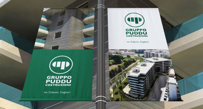
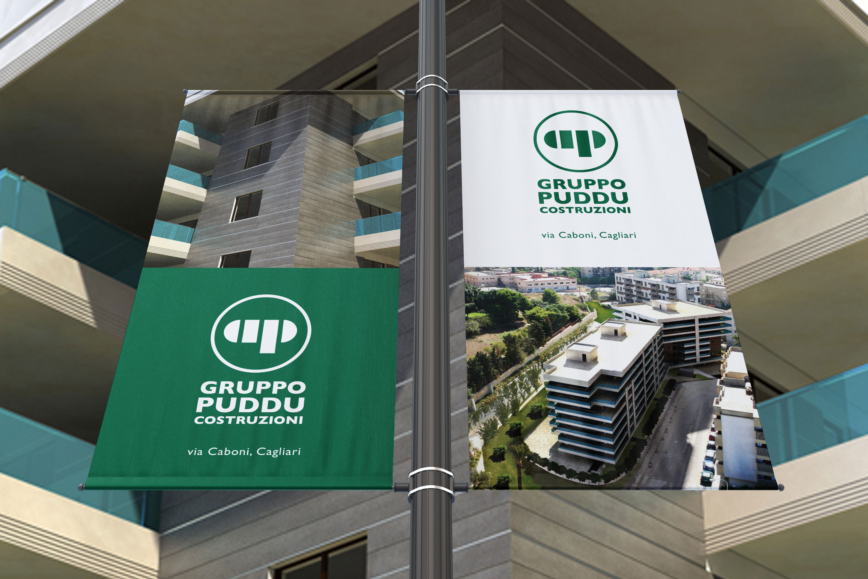
Once the brand was created, there was the development of the coordinated corporate stationery, the website and the social media pages along with the offline adv campaign on external panels and publishing press.
VISIT www.gruppopuddu.it